AI vs. Designer Round 1
I have been seeing a lot of AI vs designer challenges on social media. Spoiler alert: the great designers always win, which is absolutely how it’s going in real applications. For a twist on the popular match up, I thought it would be fun to put the brief for a particular brand identity design that I designed a couple of years ago into ChatGPT. I wanted to see what it would do with this project because when I designed it, there were some basic shifts early in the process that lead to a very different outcome than the original idea. I wanted to see if AI would pick up on the issues.
I input the exact brief and sketches that I started with, so I had no advantage in this match up.
The Brief From the Client:
This ice cream shop business has been around since 2010 but we are purchasing it and want to rebrand the whole concept and business as well as change up the look in general.
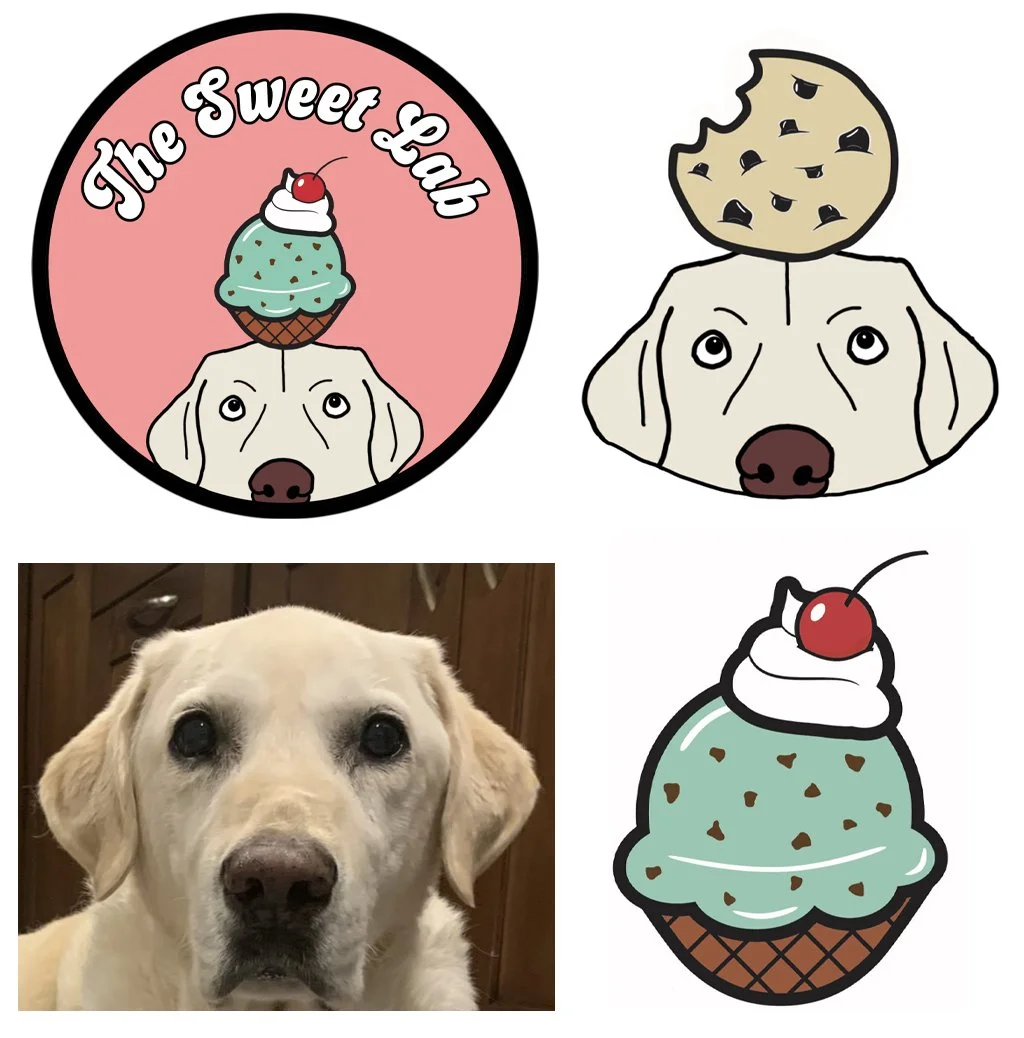
We would like to incorporate our dog into the logo, but still make it apparent that it’s a sweets/ice cream shop and not a dog shop. We are thinking calling it "The Sweet Lab" to play off of our dog, but also the "sweet" offerings and creations we'll have on the menu.
Ice Cream Shop in Portland, Maine, but we are planning on baking cookies as well and incorporate that into the branding. You'll see the cookie graphic attached for reference because while the ice cream would be our primary logo, we'd like a secondary logo with a cookie on top of the dog's head.
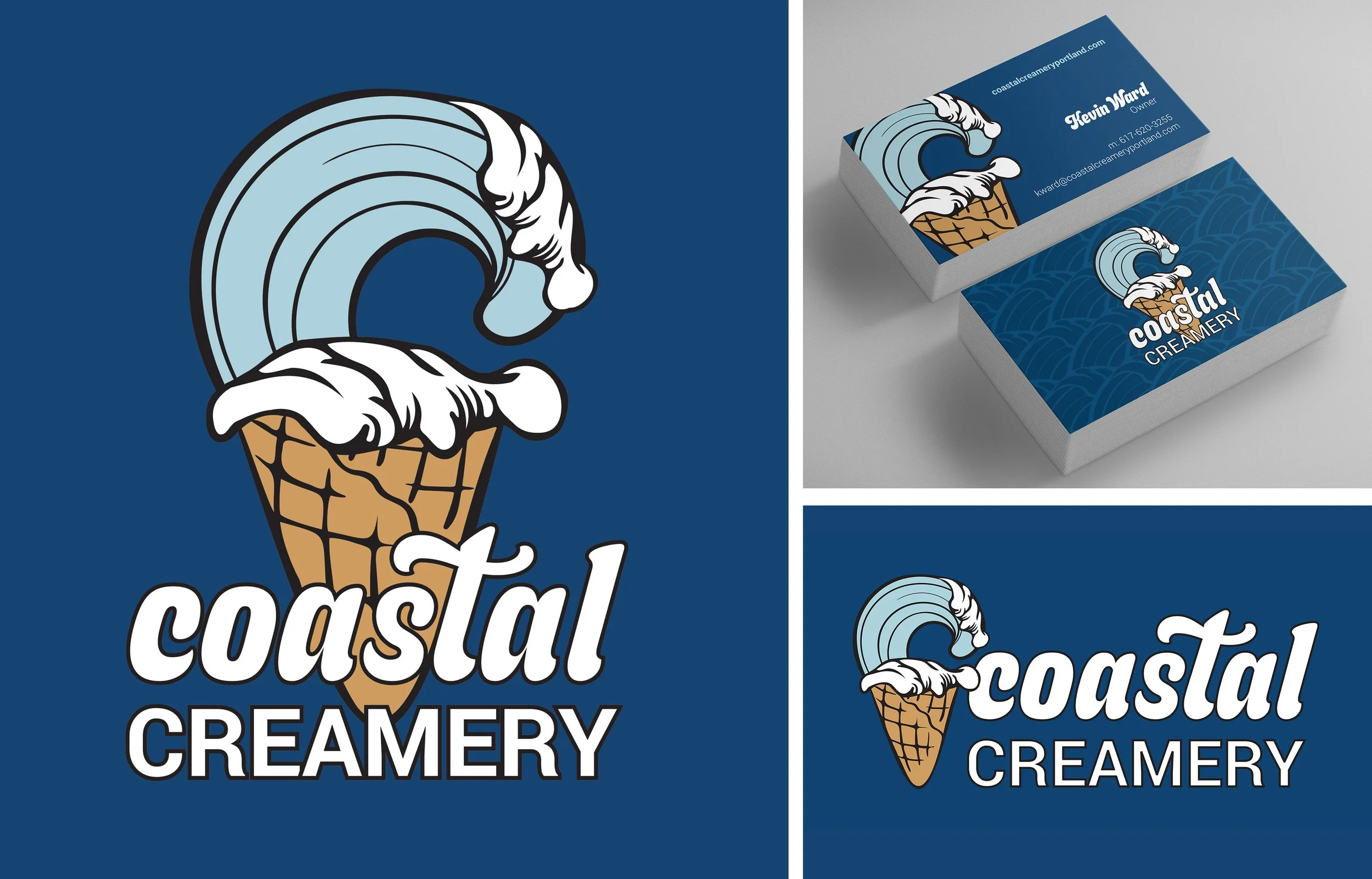
Font: "Budge" font, and you'll see there are a few options to be able to layer it if it works aesthetically, so open to what you think looks best.
We aren't locked in on color scheme yet, but did like this palette when testing some colors out.
Logo Options: I like the simplicity of just the business name and graphic as the mainstay logo, but would like to see possibly an option where "Ice Cream Cafe" is incorporated into it as well....just to see how it looks and feels with the whole vibe and style.
Let me know what you think and if you have any questions at all that may help. We do like what we came up with, but open to your pro tips and creation as well.
The Supplied Sketches:
Now, I input the brief and reference images into ChatGPT.
The Designs that AI came up with:
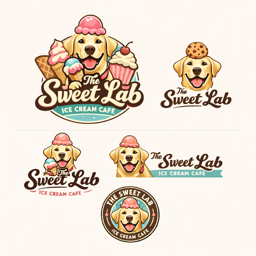
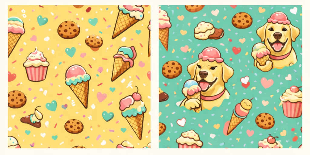
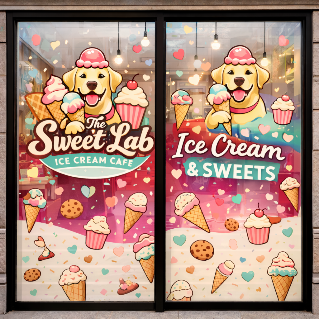
It’s a cleaned up version of exactly what they provided with the brief. It’s expected. The patterns are crazy (the dog has cat-eye makeup in one instance). The window graphics are redundant. The illustrations are far too detailed to work well as a logo.
This was the collection of the best of many prompts I tried. And I can’t get over the ice cream on the top of the dog’s head making it look like he’s on his way to a royal gathering (facepalm).
What AI failed to do that a great designer does:
Interpret the brief as a starting point, not as the solution.
Look at the owner’s ideas from the perspective of their audience:
- How will they perceive the brand?
- How will they connect with it?
- How will they remember it?How will the brand fit in in downtown Portland, ME?
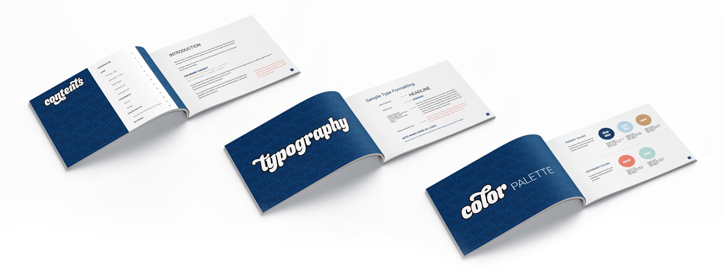
Create a logo suite that translates well across the brand - exterior signage, used at small sizes, different-shaped spaces, printed on apparel in a single color, for example.
The biggest problem with AI’s Designs?
The BRAND Strategy is off.
While the client’s idea of using their dog was a sweet idea (pun intended), the first thing that I thought when I saw this brief was that people walking past the shop on the street will easily mistake it for a dog treat shop. I conducted some basic research through asking peers in design and marketing what they thought this business might be when they looked at the supplied sketches. I did not give any other context as to mimic the experience that an uninformed tourist might have when walking by the shop. Every one of them said the same thing – they thought it was for a dog treat shop. There was really no way around it when using a dog as the logo. And without the dog, the name then became a scientific concept and that wasn’t what they were going for.
AI couldn’t see that problem, even when the client mentioned it in the brief. The oversight could have cost the ice cream shop so much business.
My Solution:
The business needed a different name and identity.
It’s never easy to tell a client that their idea isn’t quite right, especially when it involves a personal connection like incorporating a beloved pet. But, I had to suggest what was best for their business. When they heard the reasoning, they completely understood where I was coming from and went back to the drawing board on a new name.
The new name? Coastal Creamery.
Perfection! It’s a strong name that clearly connects with its downtown Portland, Maine location, in the heart of the tourist area of the city just steps from the wharf, and it’s immediately clear that it’s an ice cream shop. It will attract tourists looking for that quintessential coastal Maine experience.