
Case Study: Monadnock Paper Mills Corporate Social Responsibility Report
Client: Monadnock Paper Mills
Printed By: Meridian Printing
Awards Won: 2022 American Graphic Design Award
The Piece:
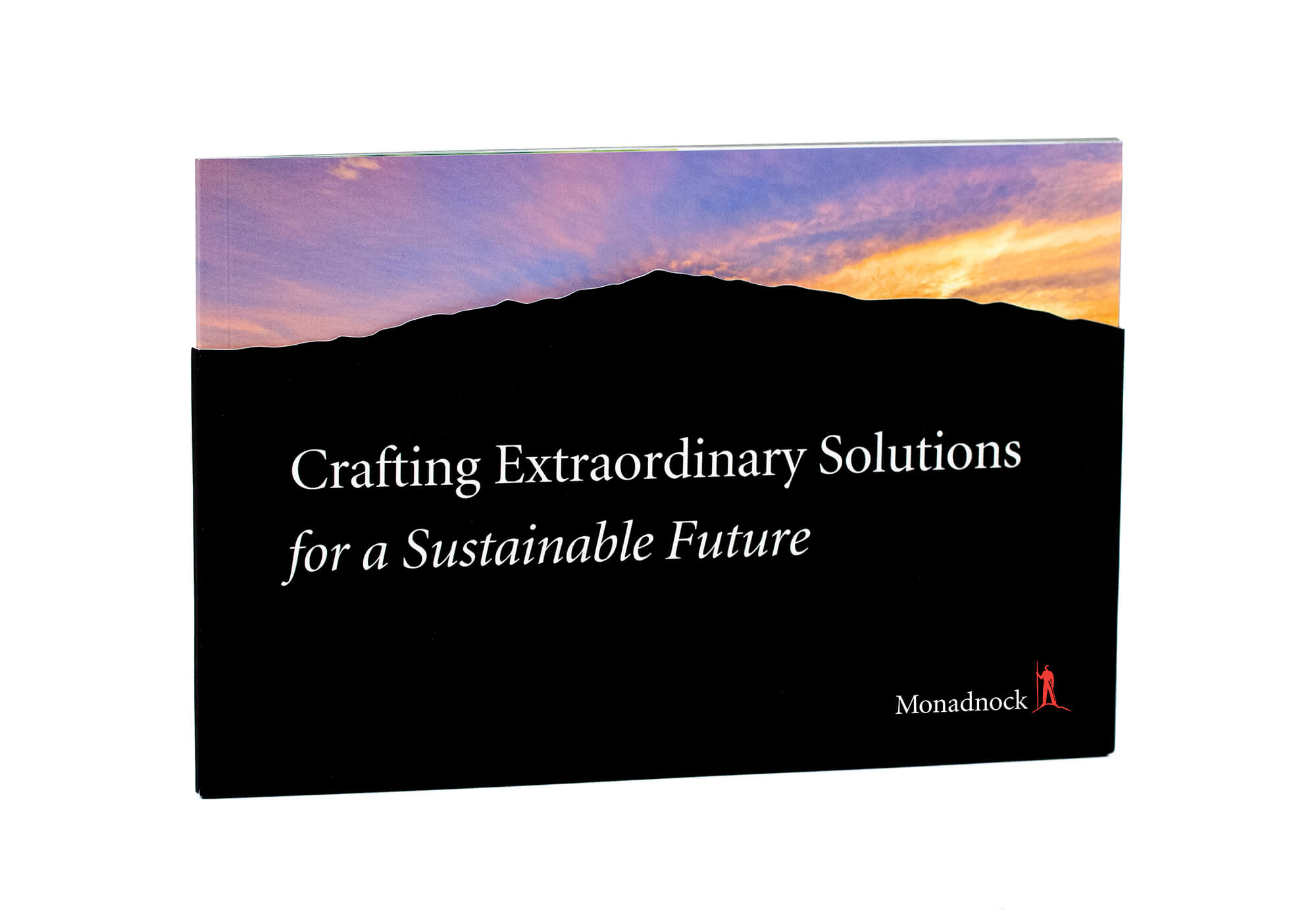
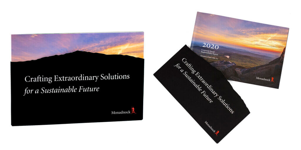
32-page perfect bound book with a soft-touch coated diecut slipcase.
Offset printed on multiple paper stocks.
The Brief:
Create a book that delivers a story-like experience throughout the corporate sustainability report design.
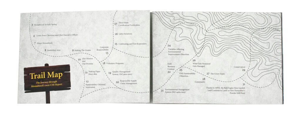
Like the idea of using trail signs somehow.
Use imagery or illustrations of the Monadnock Region of New Hampshire, where the mill is located.
The Concept:
The biggest challenge in the initial brainstorm phase was to tie in the trail signs in a way that didn’t feel childish or forced. They needed to be fully intentional and well-executed. Initially, I thought that this concept would work best as an illustrated piece. However, since there were 32-pages, it would be very time-consuming, and therefore very expensive. In the best interest of the mill’s budget, I needed to try to make this work using photography.
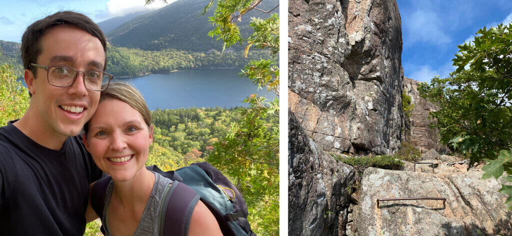
During this phase of the project, my husband and I had a trip to Acadia National Park planned. The concept came to me while we were taking in the beauty of the views from the Jordan Cliffs Trail. I needed to hike Mt. Monadnock and photograph what I saw along the way to the top to create the visual experience. Because we needed to fill 32 pages with imagery, a custom photo shoot was an even better use of the budget than purchasing all stock images. Not only is good stock expensive when you need this many images, it was going to be tough to find images that were taken at Mt. Monadnock and the surrounding area.
The Photography:
I love to be the photographer for projects I’m working on when the opportunity presents itself. There’s something about being behind the camera that gives me a different perspective. Not only did I walk off the White Dot Trail with a library of imagery, but the experience gave me so much inspiration for how to design the book. It’s amazing what time away from the screen can do!
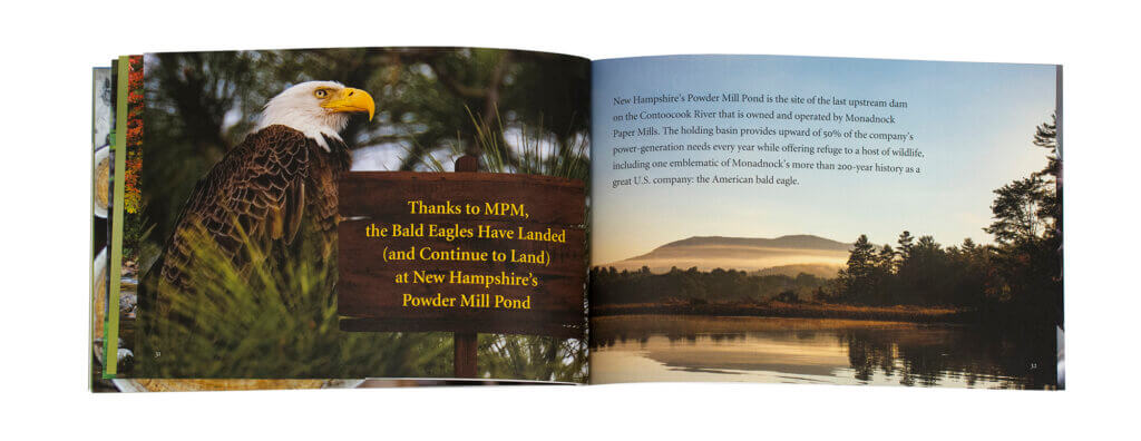
While I got most of what I needed from my outing, there were a few holes I needed to fill with specific imagery. It was an overcast day at the mountain, so I couldn’t get the sunset photo I needed for the cover. I also wanted a lush, green profile shot of the mountain, but it was early October and the foliage was beginning to turn. There wasn’t time in the day to get to Powder Mill Pond for a shot to accompany a story about the eagles that live there. So to fill these gaps and a few others, I looked to existing work from local photographers:
Cover Photo: Randy Roos
Dublin Lake Photo: Peter Imhoff
Powder Mill Pond Photo: Ridgelight Studio
The Final Design:
The black slipcase features a diecut in the profile of Mt. Monadnock. The idea behind this is that seeing the mountain’s profile as you approach the hike is the initial experience you have with a mountain. Before the slipcase is removed, you see the mountain with the beautiful sunset from the base. As you remove the slipcase, the profile view turns into a sunset view from the top of the mountain. This creates a beautiful juxtaposition of beginning and end and views from different perspectives. It also brings a feeling of transparency and peeling back the layers, which is the entire premise behind a corporate social responsibility (CSR) report.
You open the book to find the table of contents that is designed to look like a trail map. The topographic lines feature a subtle emboss to add texture. As you unfold the gate-fold panels of the map, the introduction to the report from the CEO and Chairman of the mill is revealed.
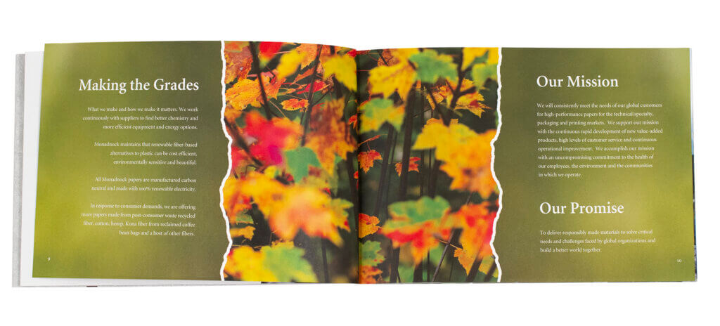
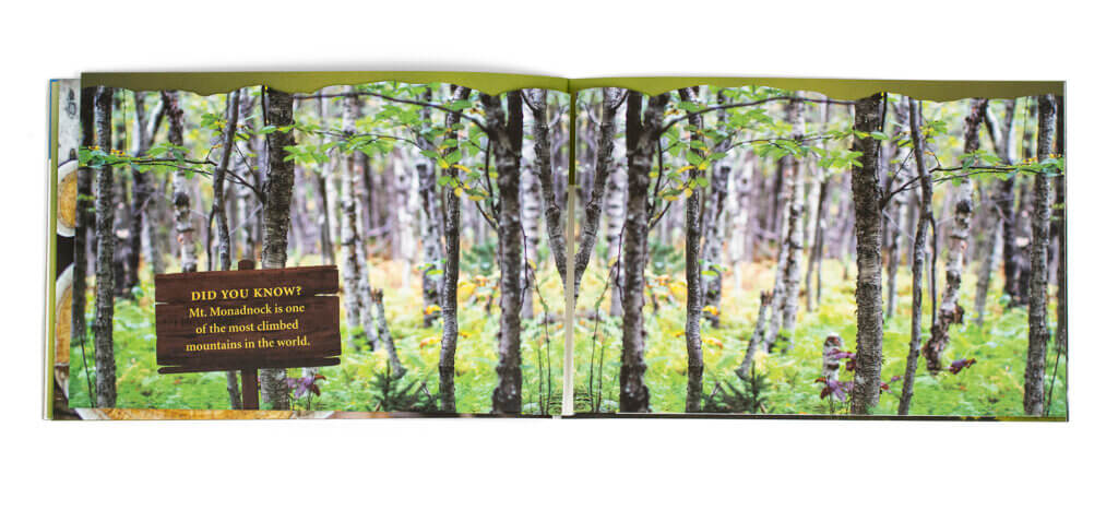
As you turn the pages and the story of Monadnock Paper Mills unfolds, you are taken up the mountain and around the Monadnock region through detail photographs of what you would see along the way. There are gate folds and diecut fold-down panels throughout the book that give a feeling of exploration.
Printing and Production:
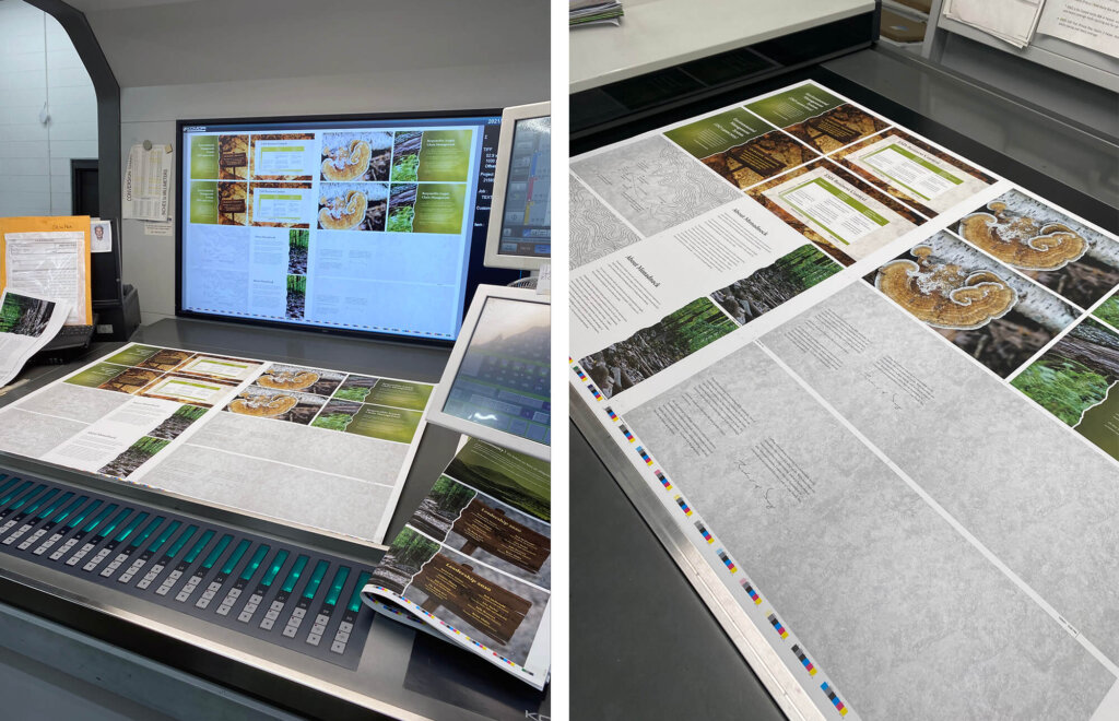
We started the production conversation with Meridian Printing early in the process. We had some ideas that would be complex from a production standpoint. Bringing Meridian’s expertise to the table was key to avoiding production problems.
Originally, we wanted to do an exposed Smythe Sewn binding. This would give it a rustic, handcrafted feel and it would allow the book to lay flat when opened. Ultimately, it was going to take too long to produce, so we went with perfect binding.
One of the most important steps in the design and pre-production phase is full-scale mockups!
Gate folds and fold-down panels are difficult to achieve inside of a perfect-bound book. To avoid the possibility of panels getting stuck or dog-eared, Meridian made several mockups to get the page sizes right.
Both the book and the slipcase were offset printed. We used conventional 4-color printing with a spot PMS 032 (Monadnock Paper Mills’ brand color). We used a soft touch coating on the slipcase to create a visual and tactile contrast of dull and smooth with the coated book cover.
On Press:
I traveled with the Monadnock marketing team to East Greenwich, RI and spent 2 days at Meridian Printing on the press check. This book features multiple cross-over images (photos that are on both sides of the spread, and are therefore printed on different sheets of paper), so we had to keep a very close eye on color to ensure proper color match. Additionally, a few of those crossover images were printed on different papers. This added another level of complexity to color matching. Meridian did a wonderful job on press!
Sorry, the comment form is closed at this time.
Pingback: 2022 American Graphic Design Award Winner - Blossom Creative